Getting started with Angular Material - Creating a custom Dialog Component
Introduction
Angular is a popular framework for building single-page, interactive applications.
With Angular gaining more popularity, we have the opportunity to use libraries that provide us with built-in UI components that allow us to focus on the code that will make our app stand out. ;)
In this tutorial, we will examine how to use Angular Material in order to build a clean and reusable dialog component.
We will focus on reusability, meaning that we will build a single custom dialog component that we will call when needed via a service class. This will help us avoid duplication of HTML templates and CSS classes, as well as improve Separation of concerns throughout our app.
You can find the sample project in my Github repository
Getting started
Before writing any code, we need to set up our project. Angular uses a command line interface (CLI in short) in order to use its various commands. This tool can be installed as an npm dependency.
We assume that you have npm installed as a global dependency on your system. You can verify a correct npm installation by running:
paul@spiderman:~$ npm -v
6.4.1
(Yes I name all my computers with Superhero names, isn’t that totally awesome?) :D
Great, since we have npm installed, we can go ahead and install the Angular CLI tool:
npm -g i @angular/cli
(-g states that the dependency will be installed globally)
If the installation process finishes successfully, we can use npm to print all global dependencies:
paul@spiderman:~$ npm -g ls --depth=0
/home/paul/.nvm/versions/node/v10.15.3/lib
├── @angular/[email protected]
└── [email protected]
Great! Let’s create a playground project to start coding!
ng new angular-playground
After we have selected the desired set up configuration options, we can go to the project’s location and start the project:
cd angular-playground
ng serve
If everything goes according to plan, we should be able to navigate to http://localhost:4200/ and see the default Angular starting page.
Adding Angular material to our project
Now, it’s time to install Angular material and make use of it’s built-in components.
As stated in the installation guide, we use the following npm command to install Angular Material:
npm install --save @angular/material @angular/cdk @angular/animations
Next, we need to enable animations. Go to src/app/app.module.ts and add the following:
import {BrowserAnimationsModule} from '@angular/platform-browser/animations';
@NgModule({
...
imports:
[BrowserAnimationsModule],
...
})
Also, we need to specify a CSS theme that our application will be using when showing Angular Material components.
We will use the default indigo-pink theme, by adding the following import statement into src/styles.scss:
@import "~@angular/material/prebuilt-themes/indigo-pink.css";
Great! Angular Material is set up and ready to be used.
Creating the custom dialog component
Next, we need to create a new Angular component that will serve as a wrapper to MatDialog component, which in turn is
the native dialog component in Angular Material.
The point here is to create a universal Angular component for our app in order to style it as we wish and include any
required business logic code there.
We can use Angular CLI and execute the following:
ng g c dialog
A new component was created in src/app/dialog/.
Navigate to src/app/dialog/dialog.component.html and delete the boilerplate HTML.
We also need to add the DialogComponent to the entryComponents array in src/app/app.module.ts class:
Creating the dialog service
We will use Angular Services in order to create a class that will serve as a Singleton. The purpose of this class is
- Define a way to pass customization data for the dialog component
- Provide an easy way for every other component to use a dialog component
Again, we can use Angular CLI to create the service:
ng g s services/dialog
Cool, Angular has created our service located at src/app/services/dialog.service.ts.
We also need to add this service to the providers array in src/app/app.module.ts class, since we would like to have
it available app-wide.
The first step is to define an interface with the data that we will be passing each time we need to create a new dialog.
Create a src/app/shared/dialog-data.ts to include the following:
export class DialogData {
title: string;
message: string;
showOKBtn = false;
showCancelBtn = false;
}
As it is stated in the interface, we can give a custom title and message for the dialog, as well as whether we would like to also show “OK” and/or “Cancel” buttons.
Structuring the custom dialog component
It’s time to set up the dialog component we created before.
Head to src/app/dialog.dialog.component.ts and add the following:
import {Component, Inject, OnInit} from '@angular/core';
import {DialogData} from '../shared/dialog-data';
import {MAT_DIALOG_DATA, MatDialogRef} from '@angular/material';
@Component({
selector: 'app-dialog',
templateUrl: './dialog.component.html',
styleUrls: ['./dialog.component.scss']
})
export class DialogComponent implements OnInit {
constructor(@Inject(MAT_DIALOG_DATA) public
data: DialogData
,
private dialogRef: MatDialogRef<DialogComponent>
) {
}
close()
{
this.dialogRef.close(true);
}
}
Next, head over to src/app/dialog.dialog.component.html to add the required HTML template:
Defining the openDialog method
Next up, we need a method in our service that will create and handle the dialog component. Let’s add this method
in src/app/services/dialog.service.ts:
The additionalDialogConfigData object passed, is Angular Material optional configuration for our dialog component.
Before creating the dialog component, we check to see whether there is another dialog open, and we close it first.
Cleaning up app component
Let’s add a button (Material style of course) into our app root component, to test our custom dialog.
Head over to src/app/app.component.html and delete the boilerplate code.
Setting up app component
In order to add the button, we need to import MatButtonModule into our app.module.ts file first:
@NgModule({
declarations: [
AppComponent,
DialogComponent
],
imports: [
BrowserModule,
AppRoutingModule,
BrowserAnimationsModule,
MatButtonModule
],
providers: [],
bootstrap: [AppComponent]
})
Add the following to src/app/app.component.html:
<div class="wrapper">
<button mat-raised-button color="primary" (click)="openDialog()">Show dialog</button>
</div>
And the following style to src/app/app.component.scss:
.wrapper {
margin-top: 5rem;
text-align: center;
}
We are using an openDialog method in our html template. Head over to src/app/app.component.ts to define the method:
import {Component} from '@angular/core';
@Component({
selector: 'app-root',
templateUrl: './app.component.html',
styleUrls: ['./app.component.scss']
})
export class AppComponent {
title = 'angular-playground';
openDialog() {
}
}
Using the dialog service
In our openDialog method, we would like to call the openDialog method defined
in src/app/services/dialog.service.ts file.
In order to do that, we need to use Angular’s dependency injection to get an instance of Dialog service in our app
component.
Go ahead and add the dependency in src/app/app.component.ts constructor:
import {DialogService} from './services/dialog.service';
.
.
.
constructor(private dialogService: DialogService) {}
Calling dialog service
And now for the fun part!
First, we need to create an object as described in app/shared/dialog-data.ts interface.
modify src/app/app.component.ts to reflect the following:
… and that’s it! If we head over to http://localhost:4200/ , we can click on the button and see a clean, natively styled dialog:
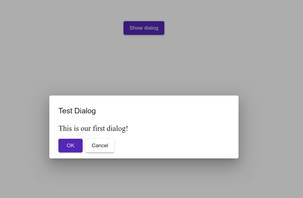
Also, if we open the console, we can see the appropriate logs when we click either the “OK” or the “Cancel” buttons.
You can find the sample project in my Github repository
Awesome, right?
Conclusion
Angular is a powerful ecosystem for building single page, interactive applications.
Angular Material is a collection of beautifully designed and clean components that you can easily integrate into your app and can save you countless hours of templating and theming.
When using an Angular Material component, think about how you can abstract it and isolate it even more by using a service, so that you can easily re-use it throughout your app!